"It has always had very positive and personal brand associations," says Kevin Hedderwick, CEO of Famous Brands. "Its product offering is also one of South Africa's best kept secrets. We wanted to communicate this and, in so doing, attract both new and lapsed users to the brand and the 90 plus outlets across the country. Refreshing the brand was a key means of achieving these objectives."
Reinvigorate and re-energise
Having partnered with Switch on a number of other projects, including Steers, Debonairs, the Brazilian, Giramundo and Keg, Famous Brands tasked the team to reinvigorate and re-energise the brand in both the two and three-dimensional space.
"For us, the starting point for this brief was capturing the feeling it evoked in each of us personally," says Gaby de Abreu, executive creative director: Switch. "We all had happy memories of moments eating its ice-cream or going there for a treat with our friends and families. It was about conveying the joy of these shared moments and creating not only a refreshed but refreshing brand that would take ownership of this space completely."
Developing the identity
Drawing on both local and international research and trends, a number of key considerations in developing the identity guided the agency.
"Soft-serve is reportedly the fastest growing ice-cream category in the world now. It is a familiar treat; something people of all ages enjoy and look forward to. In refreshing the identity, we had to create something that would appeal to a very diverse market of young and old - making the brand contemporary and relevant, whilst capturing the associated nostalgia. We also needed to pull through the strong heritage of the brand, especially as it has already been trading in South Africa for 53 years," says De Abreu.
Capturing this heritage in the new name 'Milky Lane and Co.', which takes one back to summers at the seaside, boardwalks and funfairs, Switch then went on to design a logo that spoke to all of its various audiences, inspired by the ice cream. "We made the blue 'heart' holding element a shape similar to a scoop of ice-cream while the 'chocolate-swirl' of the name drew on the motion of squeezing chocolate syrup over your soft-serve."
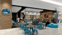
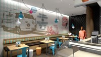
Store design
In translating the two dimensional identity into a 3D store environment, the interior architectural design team used artisanal and industrial elements to evoke a sense of homemade goodness. "By using wood, stone, metal and screeding, we've been able to give the stores a more organic feel - and a sense of authenticity and originality," says Michelle Anderson, design director: Switch.
"These materials also allowed us to create a platform for the product to be the hero, with the ice-cream, toppings and other key ingredients adding bright colours to the more neutral blue and brown tones." She adds that being able to work in the two and three-dimensional space has ensured all of the required elements have been brought to life in the shop environment.
While the identity has been an exciting one to create, De Abreu says that the project has also been extremely rewarding and fun to work on. "We have all felt like kids again, surrounded by all of the old menus and branding, but also a real sense of responsibility in terms of sharing the same joy of our memories with both old and new customers going forward. We hope that our work will inspire them to make new happy memories well beyond this summer."