Ever read a statistic about the population that should apply to you but just doesn't seem to gel? Andrew Fulton of Eighty20 explains why...

An example from Eighty20’s ‘New Normal’ Slide Pack
click to enlargeMarketers, advertisers and journalists tend to prefer words to numbers - that's why they didn't go into a career based on numeracy, financial journos notwithstanding. But you just can't get away from the importance of statistics - the more creative fields still rely on knowing how to interpret data in order to make the best ad placement decisions and reporting on regular data releases. But so many of us are in these fields because Algebra and the like just rubbed us the wrong way in school. Where does that leave us?
Well, on Thursday, 8 April I attended the first Cape rendition of SAARF and Eighty20's secondary data training session, held in the Rococoa cellar in the Palms Lifestyle Centre, Woodstock. I was the only one of ten attendees to test the data on an iPad as everyone else lugged their laptops along. It was refreshing to carry something so light - and pleasing that the software demonstration worked much the same as it would have on a desk device.
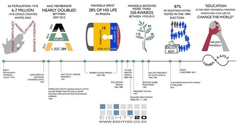
Infographic about Madiba
click to enlargeMarié Rossouw, project manager of SAARF and Andrew Fulton, partner of Eighty20, kicked off the session by explaining it would be about the way Eighty20 XtracT works, but was definitely more about using data accurately than about pushing the product. As a Canadian, Fulton comes from what he calls "a different data mindset", but he loves immersing himself in South African data and loves that there really is something new to share every single day on the Fact-a-day section of the website and daily email.
Moving on to demonstrate just how XtracT works, attendees all had the opportunity to log on to XtracT and play with the data themselves, as it is in essence a data table. As a user you need to decide if you are analysing the 37 million individuals in South Africa (for instance, regarding whisky or magazine preferences), or the 15 million households (for instance, if you want to learn more about appliances in the household), by selecting either the SAARF AMPS individual or household database. It's important to remember that LSM, which is a fluid measure of living standards, applies to all members of a household, not just to the breadwinner.
Filtering, indexing and analysing like the best of them
Entering a query pulls the full South African Population of adults 15+, and you can filter down further from there. This is where things get really interesting. For example, the latest AMPS data shows that divorce is highest among the upper LSMs - one hypothesis is that the high legal costs involved put off lower-earners, who rather go for separation.
When would you use filtering? Fulton recommends it when sizing a market. For example, you could discover just how many females have accounts at a certain bank to determine whether launching a gender-specific product or service to them is a good idea, before you put in any of the real legwork.
Next, Fulton spoke of indexing, which shows how your identified subsection differs from the overall data population. This is particularly useful in identifying the minorities in a specific distribution or how certain sub-segments differ from the large population, for instance, how women prefer to drive Citroens and men, Isuzus. But remember that you're comparing segments of interest to the total population, so smaller data sizes may lead to inaccurate data inferences. In fact, Eighty20 and SAARF alike issue a health warning whenever a data sample is limited to 40 or less.
Lastly, don't be afraid of analysis. "If all you're doing is an AMPS run, you shouldn't be earning as much as you are," says Fulton. All data provides a learning opportunity, which comes with moving deeper into the data. Fulton pointed out that everything is relative, so must always be looked at in relation to other things. While data in isolation can be useful, comparisons are more interesting and provide context, especially if you include the actual figures and not just the percentage. What makes the XtracT offering shine in this regard is that you can download the Excel pivot table, which gives more functionality and lets you customise it by isolating further and highlighting certain trends. It gives you the single-response and multiple-response data sets, which is a little harder to analyse but good to have at hand.
Fulton warned to also be careful when looking at trends in AMPS data, particularly when trying to explain a small spike or dip in the data, as that movement may only be due to the sample as opposed to any real movement in the data.
The biggest - and easiest - data mistakes you can make...
While talking us through the various ways to illustrate the results of the data sets you've selected, Fulton pointed out that the most common market research mistake is mixing 'percentage of row' and 'percentage of column'. It sounds pedantic but is remarkably easy to read a data table wrong - and it's easy for the numbers to lie if you don't know how to interpret them correctly.
For example, when looking at the media landscape lots of data is used badly, misinterpreted and misunderstood, both on the journalist and the audience's side. Take for example the statistic that it's regularly reported SAARF AMPS data shows the Daily Sun has roughly 17 readers per copy sold. This often gets met by scepticism in the industry but if you view the video on the following link of the Daily Sun's daily journey embedded below, 17 readers per copy seems accurate. So do take everything with a pinch of salt, but don't automatically naysay any unexpected results, as change does happen.
That said, there's no denying things really do get mangled along the way. For example, think of all the social studies that tell us who we are based on personality and behaviour - these are mainly based on the responses of "large social studies that were mainly undertaken undertaken in US and European universities using their, until recently, predominantly wealthy white university students", says Fulton. No harm in that until huge extrapolations to the global population are made, based on that very limited, non-representative sample. Also keep in mind that while online surveys are certainly faster and cheaper to conduct, you're already starting with a biased sample - one that's already online and has the time to tick boxes.
Then there are a whole host of non-sampling errors that can slip into the process, ranging from coverage error to non-response error, response error, processing error and interviewer error.
In closing, Fulton advised us to be aware that all data has its problems, so you need to go in with your eyes open so as to use it most effectively.
At the heart of it, accurately interpreting data is crucial as you can't actually plan a successful campaign without knowing who you are targeting and whether the message you are going with is worth spending the money to market.
For more on Eighty20 visit their website, visit SAARF's website for more on the regular AMPS reports, and click here for more on our responsibility when it comes to data accuracy and a reminder of Fulton's 'data myths' presentation at the October release of AMPS2014A data.
To register for the next secondary data training session by SAARF and Eighty20, in Johannesburg on 7 May, follow this link.


