

Subscribe & Follow
Trending


Suburban teaching methods are failing township children, discouraging teachers: What needs to change
Professor Sigamoney Manicka Naicker

#AfricaMonth


Advertise your job vacancies
Jobs
- Production Assistant Cape Town
- Brand Strategist Cape St Francis
- Brand Lead Westville
- Content Writer (Multidisciplinary Creative) Cape Town
- Multimedia Designer Sandton
- Sales Representative East Rand
In the news


Makeover for Milky Lane
The Ola Milky Lane brand has undergone rejuvenation, beginning with Fourways, Monte Casino and Eastgate in Johannesburg and Galleria Mall in KwaZulu-Natal, and will be rolled out countrywide shortly.
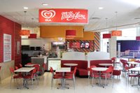
Darren Sandras, brand operations director of Promise Brand Specialists, said that despite being an extremely successful brand, it was felt Ola Milky Lane's look was dated and tired. It goes back to 2003 when the brand was repositioned and outlets were completely overhauled following the acquisition of the Milky Lane brand by Unilever.
As brand custodians, Promise was an integral part of the key store design team, partnering Ola Milky Lane's new brand team and working closely with store designer Jo-Ann den Hoed of Josh Designs.
A brand new menu featuring fun icons, colourful close ups of delectable treats and vibrant hero photos have driven the rejuvenation of the brand and its outlets. Sandras said the design team felt that filtering the tone and designs from the new menu into outlets made sense. Menus are critical to brand interaction and integral to the important relationship between what a customer saw, ordered and what he or she experienced.
He said the icons and hero shots developed for each section of the menu had already proved extremely popular and had done a "big selling job" for Ola Milky Lane. They perfectly encapsulated the carefree, fun lifestyle associated with the brand and its far wider menu offering.
New target market
Until recently, the brand's core market was families. Now its appeal is wider and includes growing numbers of teens hanging out in its outlets, as well as busy executives who can plug in their laptops and enjoy a treat at the same time. "The new store look needed to communicate the energy of the brand without being pretentious. The environment needed to be fun, lively and welcoming - a place to treat yourself and those for whom you care. It's about indulgence, although it is definitely not over-the-top,” he explained.
Store design uses iconic feel
Den Hoed described her role as taking the icons and graphics and giving Promise Brand Specialists the space within which to work. Icons were taken through to new wallpaper design and lampshades. Hero shots re-emerged on in-store posters, including those used to advertise in-store promotions.
Attention-grabbing product images and the fun icons appear on new backlit display boards and counter fronts.
She said that because these were at entrances and formed the business hubs of outlets especially when it came to takeaways, the design aimed to give "as much light and life as possible.” She said the overall concept was to 'warm up' the interiors of outlets. "Instead of completely remodelling the restaurants and kiosks, we decided to retain familiar objects to which customers could relate. We wanted to keep a familiar feel and then to use graphics to push the brand as much as possible."
An example is the use of cheeky phrases on store walls and bulkheads above counters. Until recently, they have been kept simple. Den Hoed selected furnishings ranging from bench seats to round tables and poufs to divide the space and emphasise interaction, which is central to the eating experience. Although she used the bright colours that are inseparable from the brand image, she replaced white tiles with beige ones to minimise stark contrasts and do away with the 'canteen feel' of old.