


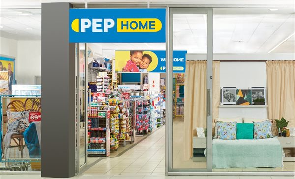
New brand identity for 55-year-old Pep
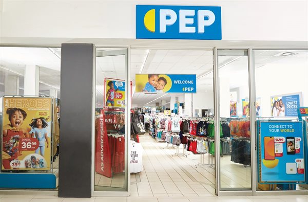
Pep engaged Superunion Africa, a division of Ogilvy South Africa, to spearhead the project which has culminated in a comprehensive brand relaunch from mid-August 2020. The refresh includes the revision of the full suite of internal and external branded collateral, consulting on the flagship store format, new store signage for all formats, in-store elements, digital and social touch points.
“This is much more than just a logo change, it’s a bold statement of our confidence in the future of Pep and of the country," says Pep CEO Jaap Hamman.
Hamman explains that the Covid-19 lockdown simply confirmed the retailer's commitment to a process they’ve been working on for a long time. “We’ve been talking to our remarkable customers, looking at our market, improving our positioning of lowest prices and significantly evolving the way we do things. We’re now in a position to confidently communicate the changes Pep has made, over many years, in a relevant and contemporary way.”
Hamman adds that the brand refresh benefits Pep's many business partners in its complex supply chain as the retailer is investing in improving everything that it does "at a time of some negativity".

Flexible tab device
Following extensive customer research, Pep found that it needed a brighter direction, one that would appeal to a more forward-thinking, savvy customer and still appeal to their loyal customer base. Superunion says it used Pep’s existing brand foundations to create an identity that "delivers accessible, digital and modern lifestyle cues", while staying true to the retailer's unchanged essence and heritage.
"True to their purpose, Pep has always managed to offer customers more, in the most accessible way possible. Our approach with the new identity needed to bring this to life. The result, a simple yet dynamic tab shape that expands, duplicates and grows to deliver the idea of more through simplicity.
"Although it originated from the oval shape behind the old logo, the flexible tab device now represents the ‘so much more’ that customers get when shopping at Pep: more smiles, more value, more great deals, more amazing products, more choice and more stores than ever before. The tab shape can also used as a functional device which holds Pep’s lowest prices, a speech bubble to capture conversations or a stage to showcase more of Pep’s products," says Superunion.
It adds, "The identity is inspired by the digital world – giving you more access to content and more stories in a creative way. The new logo, colours and identity are intended to bring a contemporary simplicity to the brand with brighter and bolder word marque, making it more relevant, easier to scale, digitise and reproduce while giving it longevity at the same time."
Reflecting positive change
Pep marketing executive Beyers van der Merwe emphasises, “We’re not changing who we are in terms of convenience and lowest prices, and our unique Sikhula KunYe (growing together) culture will remain central to how we do things”.
He says the retailer's customers have mentioned that it’s important for Pep to reflect the positive changes experienced in the brand. "In future we’ll bring more consistency into our offerings and communication, and create even more meaning in the brand," says van der Merwe.
Pep notes that the brand refresh is being achieved in a "phased and responsible manner" through the re-allocation of existing budgets.
Related
#Bookmarks2025 Awards Learner Jury: More than just a seat at the table 1 day IAB SA: 6 key trends impacting influencer marketing 17 Apr 2025 Legit, Swagga, Style and Boardmans sold to Pepkor 3 Apr 2025 Pepkor to buy Retailability adult clothing businesses 26 Mar 2025 Dentsu Creative scores second win under Pepkor umbrella with FoneYam 19 Mar 2025 IAB South Africa 2025 Bookmark Awards names nine jury chairs 11 Mar 2025


