News

Industries

Companies

Jobs

Events

People

Video

Audio

Galleries

My Biz

Advertise

Submit content

My Account

Shopfitting & Merchandising Opinion South Africa

Influential use of colour in store design

Colour has a profound influence on the emotion of a consumer. It affects how a person behaves, can alter movement patterns of consumers and influence their shopping patterns. Therefore, its correct selection and use is critical in effective retail design.
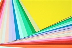
Image courtesy of Rawich at FreeDigitalPhotos.net

Colour can increase brand recognition by 80%, according to a 2007 study by psychology and management researchers at the University of Loyola, Maryland. Colour can account for up to 85% of the reason people buy one product over another, according to the Colour Marketing Group, a professional organisation for colour designers in Alexandria, US.

The reason that we react so dramatically to colour, is because colours help us make sense of our surroundings; about 80% of information reaches our brains through our eyes.

Emotional, cultural response to colours

We are all wired through evolutionary survival instincts to have certain emotional responses to colours. These responses are reasonably uniform but there are a few cultural differences. For example, yellow is a sacred colour in the Chinese culture, but signifies sadness in Greeks and jealousy in the French. In western civilizations, white is the colour of purity and widows wear black as a symbol of mourning. However, in many Asian cultures, brides wear black whilst white is the colour of death in China.

In terms of the practical application of colour in effective retail store design, the following basic guidelines should be followed:

Image courtesy of antpkr at FreeDigitalPhotos.net

  • Warm colours - reds, oranges and browns: These are inviting and reassuring to shoppers. Oranges evoke emotions of joy that will decrease anxiety and increase dwell time. In other words, happy customers will linger longer in your store and the longer people spend time in your store, the higher the chances of them making a purchase. Certain shades of orange are also known to stimulate appetite, which is useful for restaurants. Higher intensity colours such as red are used very successfully in many fast food outlets where the aim is to increase purchase decision speed and move people through the space faster. Retail in turn can make use of bright colours such as red or yellow to grab customer's attention. Red means stop and yellow for example is the colour that is first perceived by the retina. In the correct lower frequency shades, softer colours can appear more sophisticated and represent opulence, which supports a higher end shopping experience.

  • Cool colours - light blues and light greens: Light blues are said to be reminiscent of the ocean and sky, which are elements that engender a sense of peace. These are therefore effective as a calming device in slowing customers down and relaxed customers are prone to buy more. It is however not as effective in a restaurant as it is, for example, in a bar where blue stimulates one to order another drink. Shades of light green or deeper green can on the other hand stimulate a sense of peace, freshness and health. This colour is a good support for health food stores, pharmacies etc. Darker greens, on the other hand, have a strong reference to affluence and high quality items.

  • Purples and Pinks: Purple possesses some of the qualities of both red and blue and represents an air of aristocracy, mystery and spirituality. Shades of pink are energetic and fun and are useful when women are required to support the idea of romance.

  • Blacks, Greys and Whites: Black is dramatic and can be perceived as youthful. It is also very practical in a retail space. It is useful as flat blackout colour to support colourful products. However, one is also programmed to view black as a backdrop for information. This is therefore applied in areas to inform customers about products and product pricing. Black or dark grey is also often used for ceiling space to black out unsightly services and is useful to make one focus lower down to where the colour and products are on display. White in turn, can of course be seen as the absence of all colour and, similar to black, can serve as the background for more colourful signage, information or visual merchandise. In the correct application, similar to black, white can support the correct product as the hero especially if it is colourful as in food. Black has been used for this effect quite successfully in packaging, most notably of course in the Woolworths food stores.

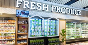
    Although the effect of colour on human behavior is well studied and documented, one is often amazed at how many retailers can, and still do, get this wrong. Apart from all the other tricks applied in retail, the one major psychological influence that all retailers can take advantage of easily and relatively cheaply is colour.

    Colour can mean everything to a successful store... I would go so far as to say that it is less about creating the most beautiful shop, and more about creating the kind of store that responds naturally to human behavior and instinct, the most primary of them being a shopper's response to colour.

  • About Callie van der Merwe

    Callie van der Merwe is CEO of Design Partnership.
    Let's do Biz