#AfricaMonth


Trending


 Netflix reaches 40m users for ad supported planKarabo Ledwaba
Elections 2024
Jobs
- Junior Graphic Designer Umhlanga
- Account Executive Umhlanga
New look for Zebro's
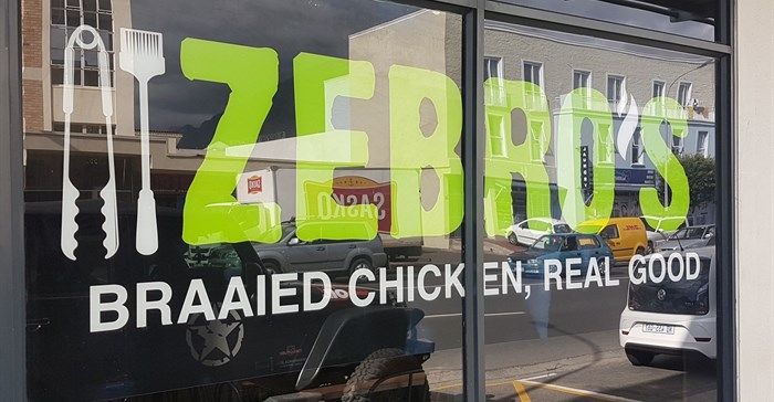
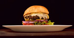
Zebro’s started in the 90’s and grew from a small store in Caledon to over 54 stores across South Africa. The brand’s popularity rests on its coal-braaied chicken and unique basting sauce.
The company chose to return to its Cape roots with the unveiling of its first new-look store in Stellenbosch last week.
“Every brand goes through a period of reflection that requires business owners to assess their standing in the market,” says Jan de Beer, managing executive for Zebro’s. “The revamp follows a shift in strategic direction for the brand.”
Chicken is the largest and most competitive category in quick-service restaurants (QSR). Consumers are bombarded with a lot of different messaging and in tough economic times, they think carefully before parting with their hard-earned rands.
“There has been a big change in how consumers view brands and perceive value. We asked ourselves the questions: Are we relevant? Are we connecting with consumers? Do we add real value to a consumer, not only in price but in product quality and a differentiated customer experience?”
The logo and slogan make explicit reference to the fact that the chicken is braaied and not fried or flame-grilled, while the store design aims for a contemporary and relaxed feel, according to the company.
“The refreshed look is aligned to our brand’s mission and showcases the wide variety of value meals, including a range of salads and family meal options,” says de Beer.
Related