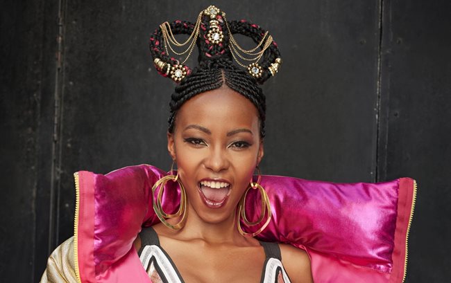
Satirical design concept used to flip monarchy on its head
‘Conquest’ is the latest fragrance line from Yardley London SA to hit the shelves, and was conceptualised entirely by Cape Town based, design and packaging agency, The Graphic Ballroom (GBR). Owner and founder, Jason Forbes, and his team pioneered the brand journey from the inception of each product to its edgy campaign rollout that went on to successfully capturing an untouched GenZ market within South Africa.
“Yardley of London SA is a longstanding client of ours. Over the last 20 years, we’ve helped them to launch many successful brands. What made ‘Conquest’ so exciting was the creative freedom it gave our team to apply their talent and imagination. Because Yardley of London has been around for three centuries it has the perception that it’s for an older generation. The brief was therefore simple. Come up with a new product that would appeal to a younger GenZ market,” says Forbes.
Armed with a detailed brief of the target market, the scent of each fragrance, GBR were given a blank canvas to work off.
“After throwing a few ideas around with the team, we pitched our top five of which ‘Conquest’ was selected and the work to bring the concept to life through the packaging, in-store point of sale and the digital campaign began. We decided to turn the traditional Royal imagery of the Monarchy on its head and created four striking variants: Crown Ambition, Lady Luxury, Regal Rebel and Daring Duchess,” continues Forbes.
Attracting GenZ
To appeal to the GenZ market, the colours had to be bright and impactful. With gold being such a standout colour for this market it was used for the crest emblems which appears prominently on all packaging. The metallic of the tin makes the gold pop resulting in a three-dimensional effect. Each variant received a personality and a name which was brought to life in a photoshoot and video and used across all platforms, from in-store point of sales to ad campaigns, window decals and social media.
“By taking a typical crown, and making a headdress of it, recovering a thrown in a kaleidoscope of juxtaposing colours, and spray painting a traditional crest, we were able to create a beautiful piece of satire, all while staying true to a brand so steeped in history. We then worked very closely with the printers to achieve the design result, which meant printing on a foil substrate and then laminating over the core. This method helped to maintain the bling factor needed to make the fragrance stand out on the shelf.” Continues Forbes.
“The Graphic Ballroom has an eye for design and their dynamic thinking, quick turnaround time and collaboration with our brand team made it possible to deliver a full 360 campaign which included packaging design, ATL communication and social media content, as well as bold point of sale elements. GBR was an absolute pleasure to work with and the successful uptake of the product is testament to this great work,” says Nicola Heimann, head of marketing at Indigo Cosmetics.