Extreme makeover for Mozambican cell company

Says McCoy, “Over time, the brand had become fragmented and application of the iconography was inconsistent. In fact, a sub-brand was superseding the umbrella mcel brand and eroding its equity. In addition, a new entrant had shaken up the cellular market and mcel needed a clearly differentiated and unique corporate identity that spoke of its vibrant energy, world-class products and services as well as its market leadership.”
HKLM was appointed to refresh the brand and roll out the new image across mcel's full spectrum of retail outlets, from urban flagship stores to rural vending kiosks.
Urban and informal rural economies
“HKLM has considerable experience building brands in Africa and we were well aware of the challenges of branding in a market that spans both the established urban economy and the informal rural one,” McCoy said. “A unique approach was required which involved in-depth understanding and insights into the various cultures and languages, buying habits and influences.”
HKLM created a monolithic brand architecture with a visual language that was both good to look at and easy to apply and reproduce. The colour palette was reduced from six colours to two, resulting in significant savings in production costs.
“The iconography is much cleaner, with the fresh new palette of yellow, turquoise, white and grey illuminating the brand's vibrant personality,” McCoy said. One of the original taglines – ‘Estamos Juntos' (We are together) – was retained as it embodied mcel's proudly Mozambican heritage and future and the ‘smile' icon was widely used to create shapes and ownership.
“Mozambicans are very discerning, with great aspirations,” said Michael Hinze, project director at HKLM. “There's a strong South American aspiration in the country, and we brought the fun-loving spirit of Brazil into the updated mcel brand.”
Collaborated with local partners
In keeping with its philosophy of collaborating with local partners, HKLM worked with local contractors and the local advertising agency for the corporate identity, marketing collateral and retail signage for the main outlets.
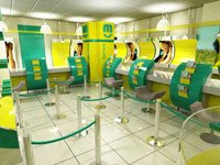
3D design was a key aspect of the brand refresh, with HKLM taking the new image into both retail and corporate interiors. HKLM drew on its extensive retail experience to design spaces that were at once practical and modular, yet sophisticated and edgy.
Because mcel's distribution spans the full spectrum of retail, from flagship stores to stores-within-stores, kiosks, franchises and informal vending points, it was vital that the brand could roll-out as easily and effectively within a rural environment as in a sophisticated first-world urban retail space.
In designing the stores, HKLM kept wet works to a minimum and ensured that all components were modular and adaptable to any environment.
“One touchpoint”
“We also had to pull the layout logic together,” Hinze added. “In the stores and franchises, the retail space encompasses both retail and service elements but we designed them in such a way that customers have one touchpoint. The open-plan space mirrors the lifestyle that mcel portrays – it's high-tech yet accessible, fresh yet sophisticated and totally interactive. The new flagship store that's scheduled to open in Maputo in early 2008 is a completely new experience – never seen before in the city.”
For the rural and more informal trading spaces, HKLM arranged a task force which gave owners practical solutions for branding their retail outlets – which ranged from wheelbarrows to more permanent structures, such as a kiosks and spazas. The team provided traders with stencils of the mcel logo, pots of paint and the paint specifications, and demonstrated how to best reproduce the iconography.
“We had absolute buy-in from the client,” McCoy said, “and it's been exciting to see the fulfillment of creative and strategic objectives in such a challenging environment. We were able to extrapolate the many positives of the ‘old' brand and incorporate these into the mcel of today and tomorrow – which is relevant, focused and contemporary.”
